
|
D-IFG
* * TRAWING FIVE only * *
|

|
Homepage (KNSE)
|
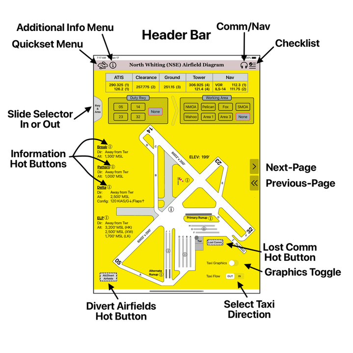
Header Bar - Present on every page. Contains the Menu icons on the left, page title in the center, and Comm/Checklist icons on the right.
Next-Page/Previous-Page Arrows - Used to advance or return between pages. Different selections by the user will change the follow-on page (NMOA, SMOA, Brewton, Jay, etc.). Slide Selector - Extends or hides the selection area for choosing the Duty Runway and Working Area. Information Hot Buttons (circle-i) - Indicates amplifying information is available. Touching on any of the icons will cause a popover page to be displayed containing the information. Popover examples are shown below. Divert & Lost Comm Hot Buttons - Touching on these buttons displays appropriate emergency information page. Taxi Graphics & Flow - Select to hide or display the graphics showing taxi routes between ramps and runways. The user can select the flow to be either OUT (outbound taxi) or IN (inbound taxi). |
|
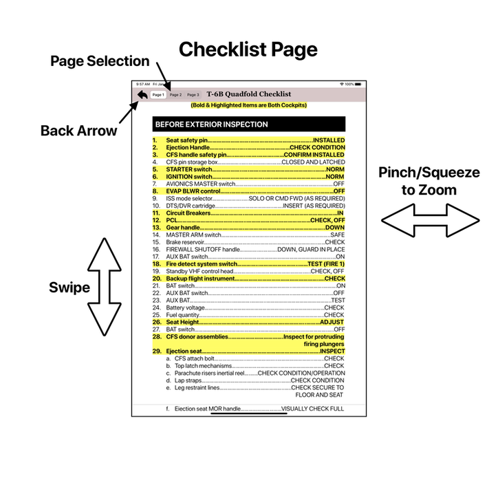
The Checklist Page is directly accessible through the icon located in the top right corner (or through the Additional Info Icon when on the KNSE airfield page). This icon will be in the header of EVERY D-IFG page. It will not be present when viewing any information popovers.
It is broken into several parts. Page 1 contains all the checklists on the front side of the Quadfold while page 2 contains all the checklist on the backside of the Quadfold. The various charts have been broken out as a separate page to make the overall checklist more fluid when scrolling. This page is built with persistence meaning that once this page is closed, the user will be in the exact same place upon their return. Page Selection - Select which page of Quadfold to be displayed or charts that are incorporated on the Quadfold. Back Arrow - Closes checklist and returns user to prior page. Swipe - Swipe up or down to scroll through checklist. Pinch/Squeeze - Zooms in and out |
|
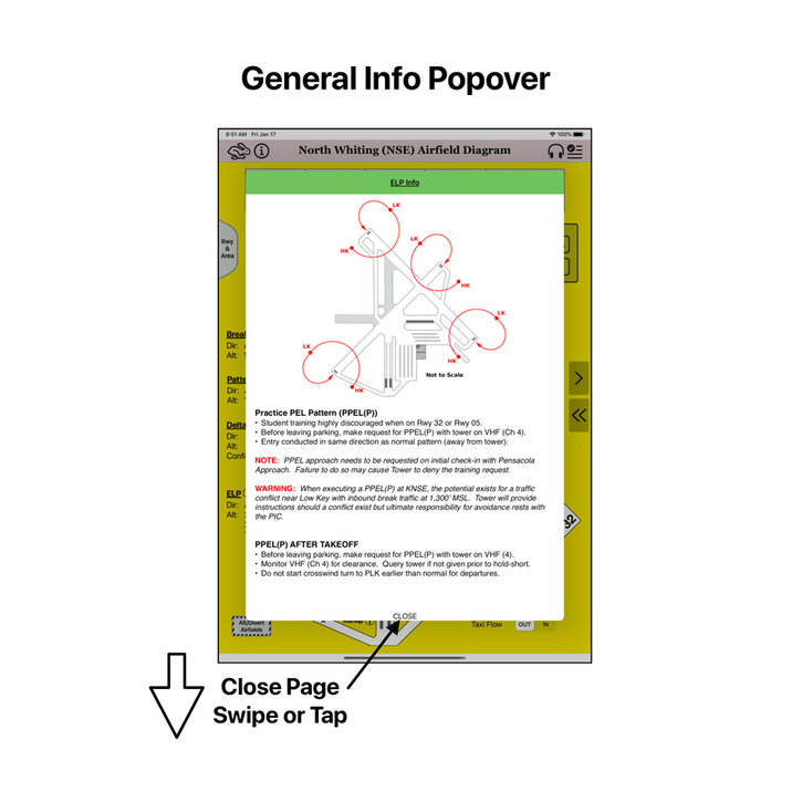
Popovers are used throughout the application to display additional pertinent information pertaining to the subject area. Some popovers will be pictures or graphics while others will be primarily text. They are used to house large amounts of FWOP information that is unavailable via the traditional paper IFG.
Popovers are activated by touching their associated screen point. On the homepage, the presence of the information icon (circle-i) indicates there is a popover available for that subject area. Simply touch the information icon to bring up the popover. The popover access point can also be a simple hot spot on the screen. This will normally be shaded to help indicate the availability of a popover to the user. An example of this would be the initial points on the entry page to the OLFs. Touching the initial point will bring up popover showing a picture of the initial point. If there is a large amount of information, the inset popover can be swiped up or down to scroll through the information available and can be pinched/squeezed for sizing. When complete with the page, touch the "Close" at the bottom of the popover or swipe down on the popover. |
|
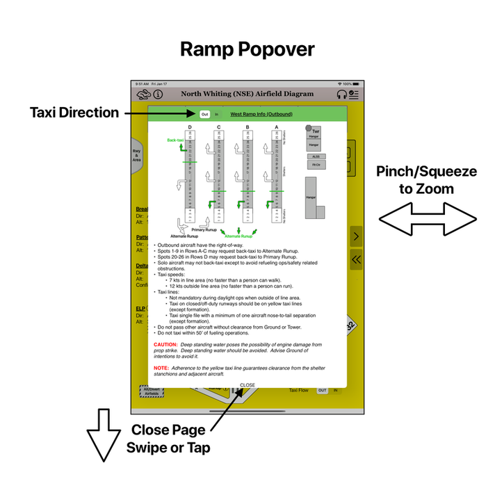
Ramp popovers provide information pertaining to operations on the various parking ramps at KNSE. All three parking ramps have available popovers.
Like other popovers, the user can swipe up or down to scroll through the textual information and pinch or squeeze to resize it. Selecting the taxi direction to OUT (outbound) or IN (inbound) will change both the information and associated graphic. When complete with the page, touch the "Close" at the bottom of the popover or swipe down on the popover. |
|
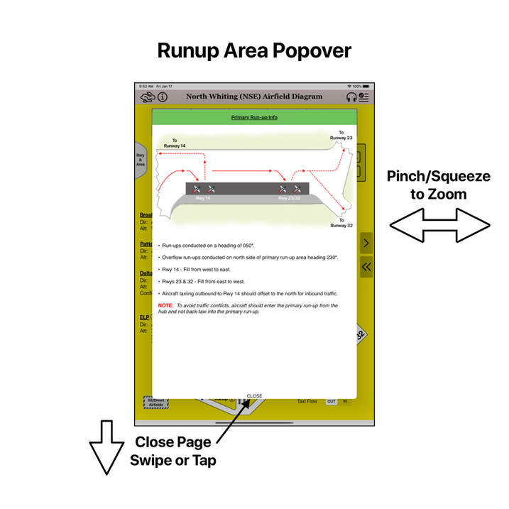
Both run-up areas (primary and alternate) have an associated popover with useful information. The run-up areas are labeled appropriately and also contain the information icon (circle-i) by the title.
|
|
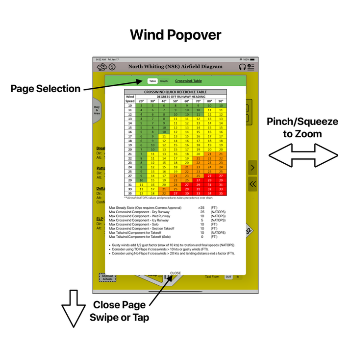
The wind popover is located on the homepage page as well as all other airfield pages. The information icon (circle-i) is located by the windsock icon to indicate access to this popover.
The wind popover provides easy access to the crosswind tables and limitations. The user can select to view the crosswind table or the traditional crosswind graph via the selector in the top left corner of the popover. |

|

|